OPPORTUNITY
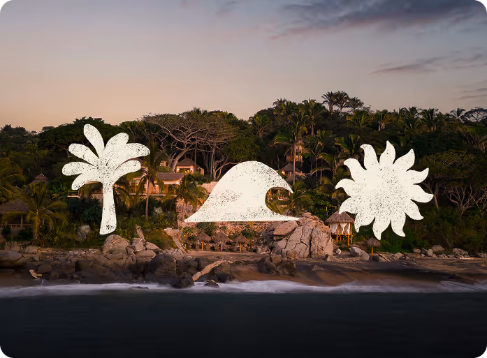
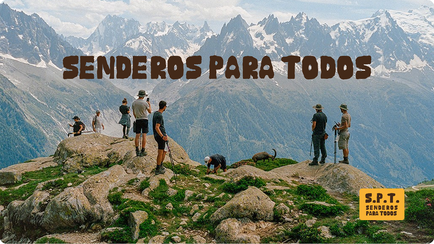
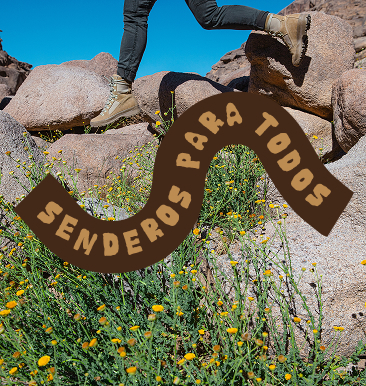
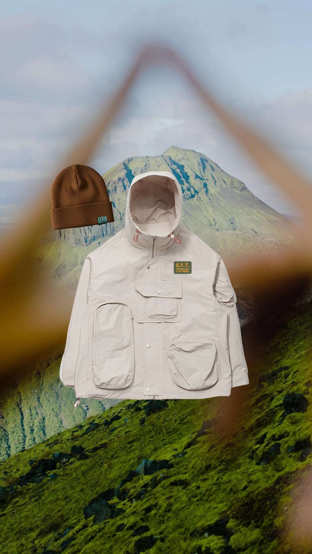
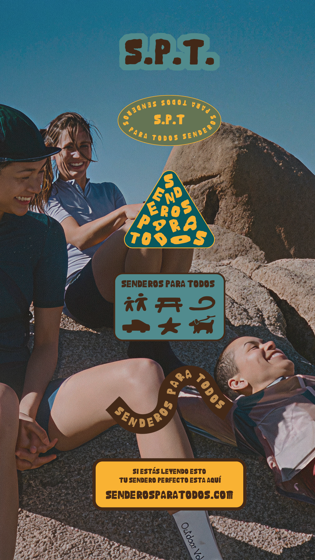
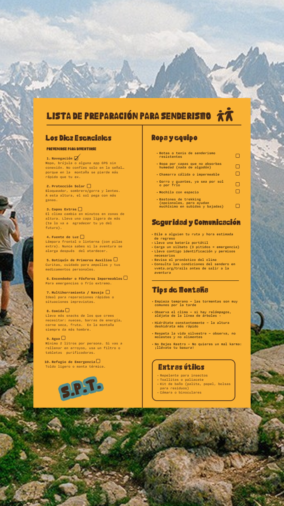
We created a brand focused on family, color and excitement using mountain colors and the bold H1 font Piedras y our friends at Dum Dum Studio. Stamps and custom illustrations were used to create a visual identity that could clarify 12 of the most important elements of understanding trails, from family- friendly to altitude.


Solution
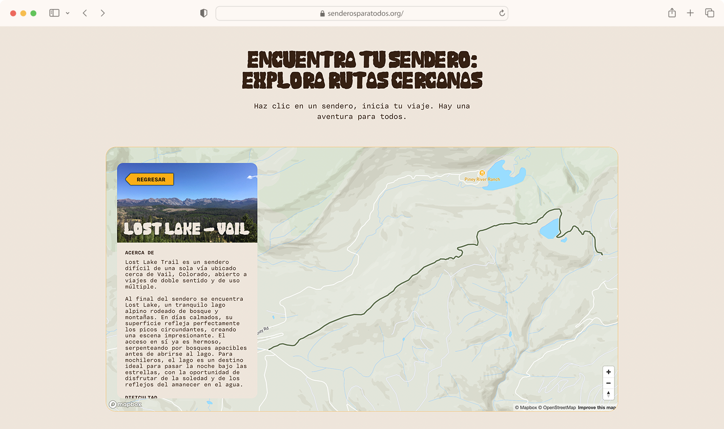
Our custom website created a free open- sourced version of Trail Forks natively in Spanish. With a custom map, it's easy to find a trail and even easier to learn about it. Not sure where to start? Take the trail quiz that uses conditional logic to direct you to the trail that is the best fit for you.
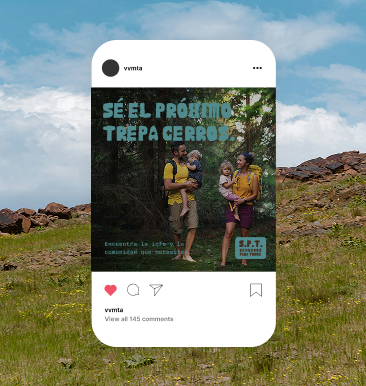
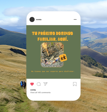
Equity-driven design principles allowed us to use iconography and color systems to meet our audience where they are. Instead of complicated guides, handmade illustrations made technical information digestible. Our community said that family-friendly accessibility was the priority so emphasizing if a trail could be used for a picnic inspired content decisions. With community partners, we sourced UGC videos to actively represent our audience more than just photos.

The outcome
Senderos Para Todos has been heralded by local organizations as a first-of-its-kind organizational tool. The website is ready to go for a busy Summer season and the brand will soon be available in a widely distributed print guide. Co-designing systems allowed the underserved to have a voice at the table and trails are now reflecting the community.

Calo was an excellent partner in developing the Senderos Para Todos campaign and supporting VVMTA’s work to improve outdoor equity. They listened closely to our goals, centered community needs, and worked collaboratively to deliver resources that feel welcoming, clear, and easy to use.

Shawna Wood
Engagement Director
Members on the project
Creative Strategy/Wyatt Shomion
Web Design Motion Graphics/Cesar Andres
Brand Designer/Ivonne Garcia-Ulloa
Project Management/Louis Madrigal